
This is the fourth guest post in the mini-series Visual Culture in Early Modern England (read the introduction and find links to other posts here). Adam Morton shares his experience of using images to get students talking in seminars, exploring their ability to get students thinking about things like opinion, polemic and ambivalence in primary material.
Adam Morton is Reader in Early Modern British History at Newcastle University. He researches the long-Reformation in England, with a particular focus on anti-popery and visual culture. His publications include Civil Religion in the early modern Anglophone World (Boydell & Brewer, 2024) (with Rachel Hammersley), The Power of Laughter & Satire in Early Modern Britain: Political and Religious Culture, 1500-1820 (Boydell & Brewer, 2017) (with Mark Knights), Queens Consort, Cultural Transfer and European Politics, c.1500-1800 (Routledge, 2016) (with Helen Watanabe-O’Kelly), and Getting Along? Religious Identities and Confessional Relations in Early Modern England – Essays in Honour of Professor W.J. Sheils (Routledge, 2012). His current project considers the visual culture of intolerance in early modern England.
Adam Morton
I’ve always found that images get History students talking. They see things I don’t see and ask questions I’ve not thought to ask. The chattiest students are often the ones I least expect, the ones who have been quiet in previous weeks, the ones you worry are struggling with or not enjoying the course. Approaching a seminar topic through images can bring those students out of themselves.
I remember one instance, long ago on a second year Reformation course timetabled in the drabness and drizzle of the autumn term’s Friday afternoon slot, with fondness. A woodcut from John Foxe’s Acts and Monuments showing Edmund Bonner, the Bishop of London, stripped to his underwear and thrashing a Protestant’s buttocks, left one usually quiet student tripping over her tongue with things to say [Fig. 1].[1] She prodded the seminar to life with thoughts about humour, about cruelty and humiliation, about images as acts of revenge, and about the control involved in having the power to portray someone. Long dead Reformers suddenly seemed very human to her. “Is the image sexual?”, she asked the room. The discussion took off. Now I was the silent one: the teaching was going well.
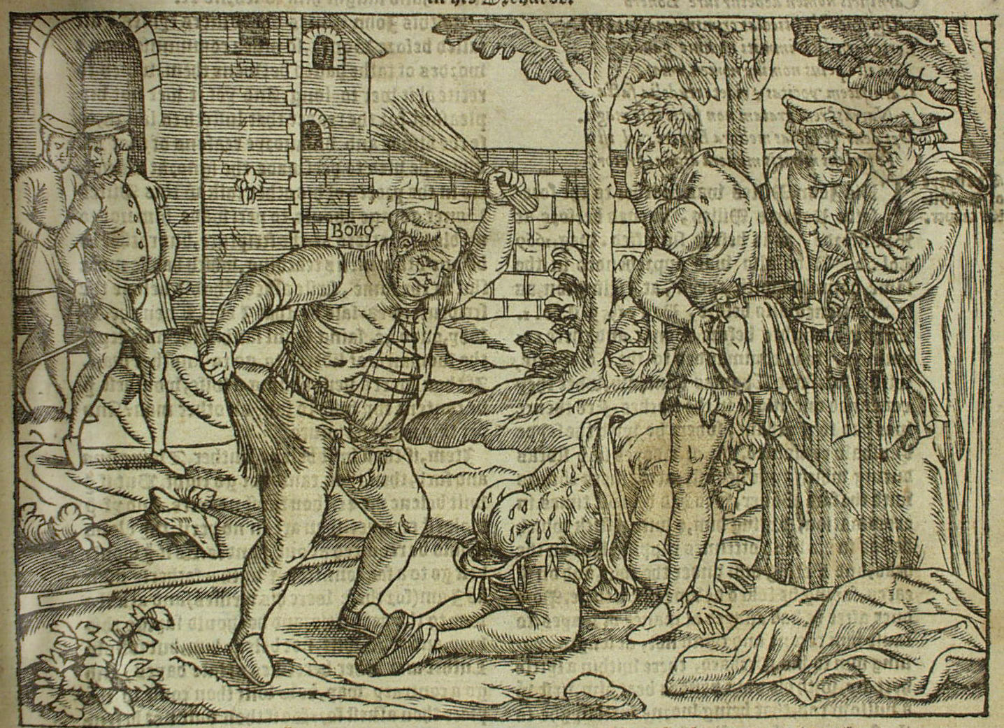
Figure 1. TITLE from John Foxe, Acts and Monuments (1570).
Foxe’s woodcuts are an obvious candidate for primary sources in undergraduate seminars, of course. Although they are no longer as rooted in public life as firmly as they were two generations ago, ‘The Book of Martyrs’’ images still provide a way into the big problems of Reformation history in the seminar room because they offer us dramatic vignettes that pare abstractions – martyrdom, heresy, theology, and memory – down to something tangible. But images can be much more than ice breakers. They can be the bedrock of seminar discussion, too.
I learnt this from a former colleague who used visual sources to teach the history of emotions in nineteenth-century England. They showed the students a photograph of a middle-class bedroom, an image that became the spine of the whole seminar. The class was asked to hone in on objects in the room – clothes, shoes, mirrors, jewellery, mementos, and so on – and by referring to other sources like diaries, journals, and cheap print they used those objects to recreate the emotional world of the people who owned them, attaching more and more stories and experiences to the photograph as the seminar went on. The point, my colleague explained, was to show how people invest in ordinary things and how those things in turn express a sense of self. The photograph was a shoreline for the discussion, a record of what they had learnt in the class that tied together the broader historical themes of that discussion – class, consumerism, gender, and urban life.
Images can do things for students in the one or two hours allocated to a seminar that other primary sources cannot. They can nudge students into less solid areas of doing history that they are often hesitant to explore, taking discussion away from the facts and happenings they like to the muddier matters of attitudes and opinion that make them nervous. History students are trained to interpret texts. The more direct a text appears to be, the happier they tend to be with it. Acts of Parliament, Royal Proclamations, and court depositions are mainstays of seminar teaching for that reason. Students tend to approach those sources as solid, even as we try to push them to see that are not. But I find that texts that concern opinion – polemic, satires, news, ballads, and so on – intimidate students. There often isn’t time in a seminar to unpick complex questions of audience, intention, tone, and context, and these sources, which need to be read against the grain, leave the students unsure. Those types of texts are always the least picked for analysis in primary source assignments.
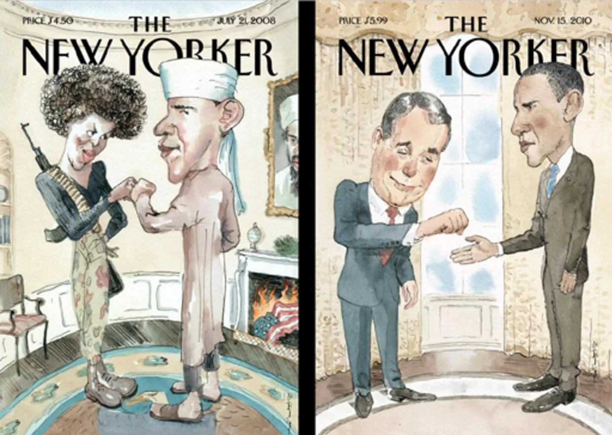
Figure 2. ‘Fistbump: the Politics of Fear’, The New Yorker, 21 July 2008.
But images can help to probe questions of opinion and attitudes in seminars. They encourage students to think about uncertainty in sources, about what to do with ambivalence or ambiguity in tone or intention. And, crucially, they allow us to get to that point in the discussion quickly. I’ve found that starting with a contemporary image like a political cartoon is a good way to get everyone’s eye in. When I started teaching 15 years ago, the front cover of the New Yorker from 21 July 2008, published during the 2008 Presidential Election and showing Barack and Michelle Obama in the Oval Office, worked well because it shocked the students [Fig. 2]. They quickly identified the component parts of the image – the Osama Bin Laden portrait in the White House, the burning America Flag, Michelle Obama dressed as a black militant – and the attitudes it pointed to – that Obama embodied twin ‘threats’ to America of Islam and Black Power. This gave us a good foundation for more challenging questions. What did this image do? Critics described it as incendiary, while the New Yorker stated it was meant to point to the absurdity of the smear campaign against Obama. Did it satirise racist fears about the Obama presidency, or reproduce them? Was the answer to this determined by intention (the artist, Barry Blitt, claimed that it aimed to satirise), or by the audience (but was there a risk some viewers would miss the satire)?[2] In every seminar in which I used it, the cover provoked a discussion about the meaning of sources not being fixed, about the relationship between the viewer and the viewed, and about how ambiguity is important to draw us in to an image. The themes of that discussion were carried over when we turned to look at early modern images.
I suspect that the New Yorker cover wouldn’t work as well now because memories of the absurdity of fears about Obama’s presidency are no longer immediate (the students who will start university in autumn 2025 will have only been 1 when the image was published). But any recent political cartoon might provoke equally good discussions about the layered nature of political representation and the difficulties of studying attitudes and opinion. It is then easy to look at early modern images in the same way.
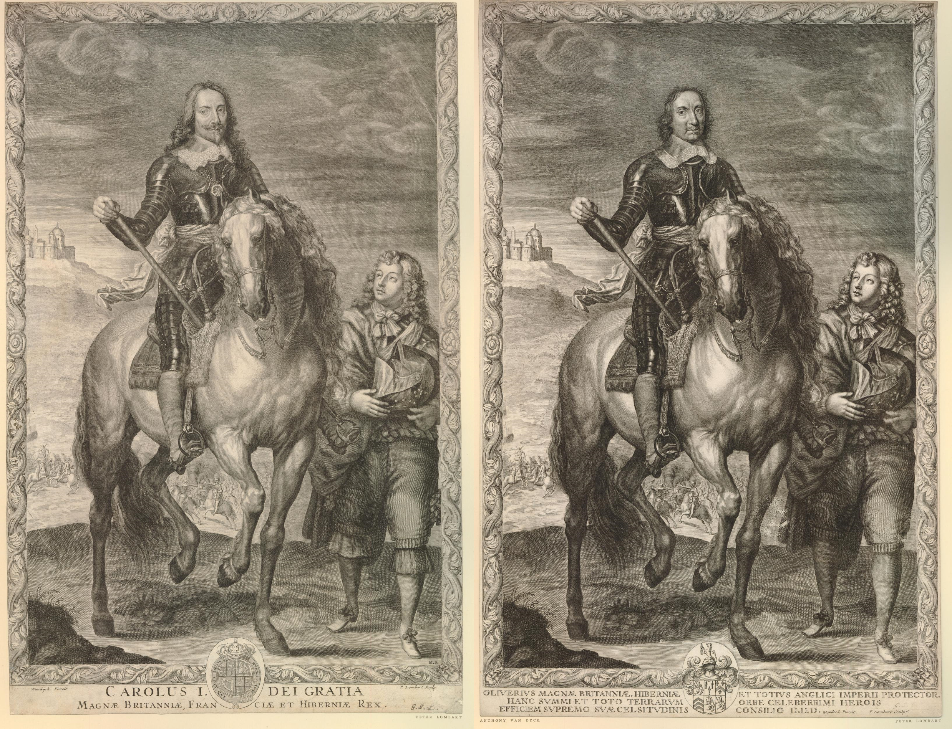
Left: Figure 3. Pierre Lombart, ‘Charles I’ (after 1655). Copyright of the Trustees of the British Museum. 1935,0413.52.
Right: Figure 4. Pierre Lombart, ‘Oliver Cromwell’ (after 1655). Copyright of the Trustees of the British Museum. 1935,0413.51.
With politics, I’ve always found starting with Pierre Lombart’s ‘Headless Horseman’ prints works well. Getting students to look at Lombart’s portrait of Charles I [Fig. 3], then making the link to Titian’s equestrian portrait of Charles V as the model for all subsequent ‘Man + Horse = Authority’ portraits, and finally showing them Lombart’s portrait of Cromwell is a simple point of entry before moving on to other political prints [Fig. 4]. When I ask what the repetition tells us, they always have plenty to say. Moving from this to look at material culture – the depiction of royalty in ceramics, for example – challenges the student to think about the spaces of politics and royalism at the turn of the eighteenth century.
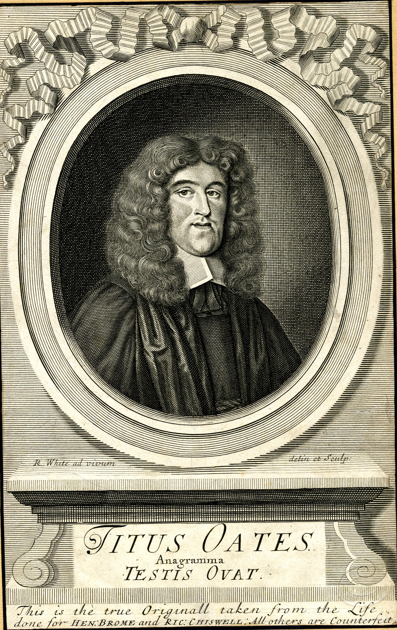
Figure 5. Titus Oates. Copyright of the Trustees of the British Museum. 1902,1011.5289.
A similar approach can be taken with histories of gender. Portraits are useful sources for thinking about self-fashioning, masculine and feminine, and satirical prints’ sending up that self-fashioning offer an excellent way of showing how conscious this satire was of the performed nature of gender. The same is true for social status. Portraits show us how convention was crucial in cultivating gentility and divinity, and students are superb at recognising the staging and framing involved.[3] Once this has been established in the seminar, it opens avenues to think about the development of media and the public sphere. Prints of Titus Oates are a good example. This portrait surprises students [Fig. 5]. Oates, dressed in the clerical robes, looks conventional and respectable. When I explain who Oates was and outline the nastiness of the Popish Plot hoax, the print’s use of the trappings of divinity and gentility to make him appear credible starts to make sense. Controlling the narrative, as it were. “Ahhhh, turd polishing”, as one student memorably put it.
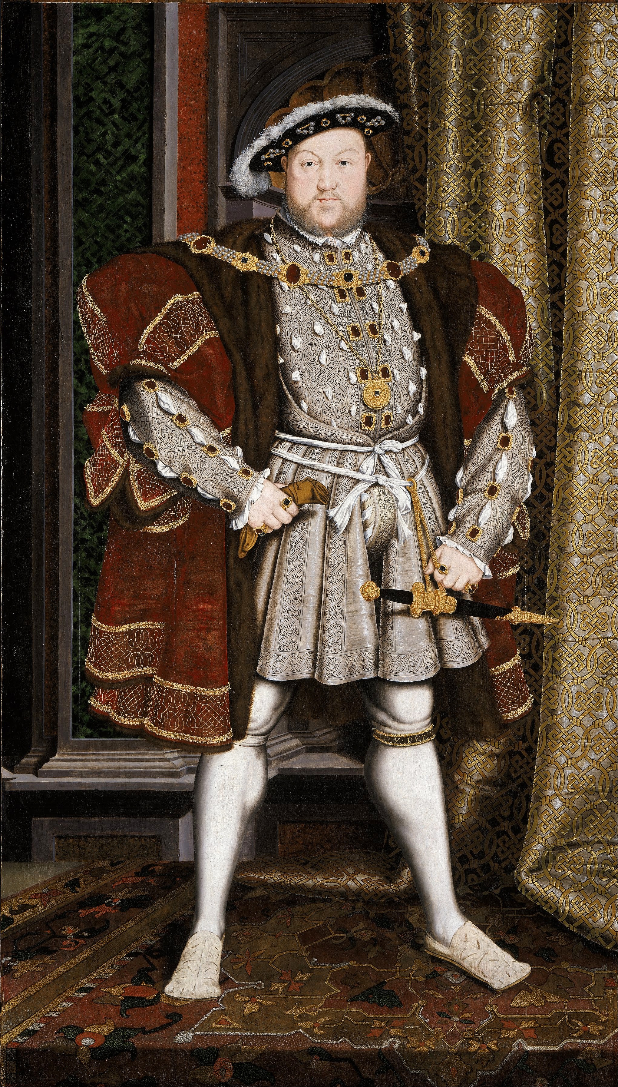
Figure 6. After Hans Holbein, Henry VIII. Walker Art Gallery, Liverpool.
But the students surprise me, too. They steer seminars in ways I don’t expect, even when we are looking at even the most well known images, like Holbein’s portrait of Henry VIII [Fig. 6]. What more can there be to say about that? Quite a bit, if one of my third-year seminars of recent years is anything to go by. We discussed the portrait, its reproduction, and its afterlife. We unpicked some of the historiography on Tudor iconography (Roy Strong, Sidney Anglo, and Kevin Sharpe). And we broadened the discussion to think about the complementary roles of policy and police (in Elton’s terms) in cultivating power in Henrician England. I was pleased: this is what I’d wanted to cover that morning. And then one student, holding his photocopied Holbein up and looking at it sceptically, upended the conversation. “I don’t buy it”, he announced. Everything stopped. “Go on”, I said. “It’s an image of weakness, not of power”, he said. No one replied. “If you’re really powerful”, he continued, “you don’t have to keep reminding everyone”. “Yeah”, nodded the student opposite, picking up the thread, “what is understood doesn’t need to be discussed”. This struck me as a good point, though one that ran the risk of making me redundant. I needn’t have worried though. During my silent panic the students had moved on to another image.
[1] There is a good literature on Foxe’s images. See Elizabeth Evenden and Thomas Freeman, Religion and the Book in Early Modern England: the Making of John Foxe’s ‘Book of Martyrs’ (Cambridge, 2011), chapter 6; M. Aston and E. Ingram, ‘The Iconography of the Acts and Monuments’, in David Loades (ed.), John Foxe and the English Reformation (Aldershot, 1997); James A. Knapp, Illustrating the Past in Early Modern England: The Representation of History in Printed Books, (Aldershot: 2003), chapter 4.
[2] ‘Fistbump: the politics of Fear’, New Yorker, 21 July 2008, cover image. For the fall out see: ‘“I’m Just Trying to Make Myself Laugh”: ‘New Yorker’ artist shares his Cover Stories’, NPR 20 October 2017, https://www.npr.org/2017/10/20/558777025/im-just-trying-to-make-myself-laugh-new-yorker-artist-shares-his-cover-stories; ‘Terroist “Fistbump” Cartoon misfires’, The Guardian, 15 July 2008, https://www.theguardian.com/world/2008/jul/15/barackobama.usa; Both Obama and his Republican opponent, John McCain, condemned the image. ‘Obama Slams New Yorker portrayal’, 13 July 2008, https://www.politico.com/story/2008/07/obama-slams-new-yorker-portrayal-011719.
[3] Another good way into this is the look at Ludmilla Jordanova’s excellent book on repetition and convention in portraits of scientists and medics. Defining Features: Scientific and Medical Portraits 1660-2000 (National Portrait Gallery, 2000).
