A plea for critical thinking humans in our world of extremes

Laura Sangha

A companion piece to: What is history for? Or: Doing history/thinking historically

The train to Totnes this weekend was full of late holiday makers heading for Cornwall. They were gratifyingly impressed by one of the greatest rail journeys in England – the swoop down the Exe estuary coast where, if you are seated on the correct side of the train, there is nothing between you and the rippling water, scattered with gulls, oyster catchers, cormorants and mudlarks.
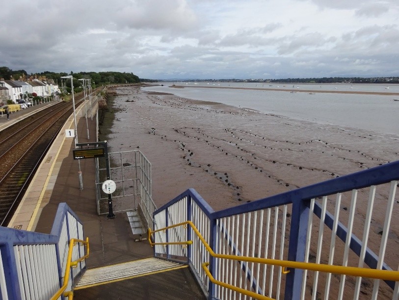
A photo taken from the bridge over the railway tracks at Starcross train station in Devon. The platform is to the left, immediately next to it is an expanse of exposed mud, with the Exe following beyond it. It's a grey day, boats can be seen on the river.
The view from Starcross train station on the Exe Estuary.

I was rather sadder to overhear the conversation as it turned to the climate crisis. Observing the rolling Devon hills, the shallow rooted grass now returned to a lush green after a couple of weeks of regular rain showers, one traveller compared it to their London experience. ‘I suppose it wasn’t as hot down here this summer’. The other, from Kent, agreed, adding ‘I expect it will be just like 1976. After that was all over things just returned to normal again very quickly’. The companion agreed wholeheartedly and conversation then moved on to the drought resistant planting that both travellers were beginning in their parched dust bowl gardens.

At first I was taken aback to again hear repeated the line about 1976. Although it was an idea that bounced around a lot during the first and second heatwaves, I felt that the persistent, life threatening heat that followed had rather snuffed it out. No doubt my own personal media bubble was to blame. But it soon got me thinking more generally about public or popular discourse, where ideas like ‘1976’ come from, and why they persist. Why can’t people see that this take on the exceptional, extra-ordinary weather we endured in England this summer is spectacularly wrong?

Of course, there are too many reasons to examine them all here, so I wish to focus on just one: a lack of critical thinking, and a particular subset of that, a failure to consider evidence. People are spectacularly wrong because they don’t have tools which allow them to weigh up an interpretation or an argument, to examine the evidence it is based on, to see it in a broader context, or to consider other interpretations and to compare and contrast them to conclude which is most persuasive.

Yes, that’s right (surprise!) I want to talk about the methods of historical study.

My job as a historian requires that I am an expert critical thinker. It is also my chief responsibility to my students to teach them how to become critical thinkers. Because I have been steeped in this way of interacting with the world since embarking on my undergraduate degree (mumble) decades ago, it’s too easy to forget that for many people it is just not something that they have been schooled in. Or if they were, it was too long ago to remember, or they weren’t listening, or they were absent that day. Or they went on to study a subject that didn’t value or prioritise it.

But in an increasingly unstable global context, a lack of critical thinking allows misinformation and lies to proliferate, even in the face of overwhelming evidence that something is a lie, that it is untrue, that it is not right. It is not right that 2026 was just the same thing as 1976, and critical thinking can prove it.
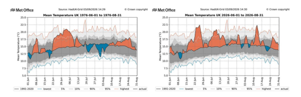
Two graphs which show the mean UK summer temperatures in 1976 and 2026. The mean temperatures were persistently higher in 2026. The graphs are from Met Office
Graphs from the Met Office article.

First, to the evidence itself. Anyone can google ‘1976 compared with 2026’ and find links to a range of articles comparing the weather conditions of the two. But you need to apply some critical thinking about the context of these articles to work out which of them is likely to contain evidence you can trust.  

All this means is asking some fundamental questions. Who wrote this? What are they saying? Why did they write it – what point are they trying to make? Who are they writing for, what’s their audience, what are they trying to persuade them of and why? What is their evidence for what they have written? Where did it come from? What are the problems and gaps in it? Who has a vested interest in what they are saying?

Might this person have a reason to exaggerate, to leave out some facts, or to tell a particular story? Is it likely that this person is misrepresenting the evidence to further their own ends?

Let’s apply these critical questions to our google list of articles about 1976.

Should I trust the Reddit thread ‘2026 is the new ’76. I will not be taking questions’? Well no – I don’t know who wrote this. I know that the social news website Reddit is full of amateur and expert opinion but how can I tell the difference from the info provided there? Just because millions of people voted a thread up, it doesn’t make it right.

How about this Reuters article then. A trusted news source, so that gives me more confidence. But the article is from July, so it can’t give me a full picture of the conditions across the summer.

What about a Mirror article from mid-August then? Again, it’s not what I am looking for. Tabloid and broadsheet content is always likely to provide an interpretation that will resonate with its presumed audience or advertisers, it follows an editorial line, and it will likely lack the detailed scientific evidence I am looking for.

Ah ha, further down the results page is a Met Office article from 4 September. That’s the ticket – the Met are a professional, trusted institution with their own archive of data. Click.

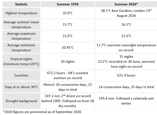
And there is the evidence, all the statistics from both years, neatly summed up in the first paragraph: ‘summer 2026 has rewritten the record books, becoming the UK’s warmest summer on record for mean, maximum and minimum temperatures, while also recording more tropical nights than 1976.

A table showing various statistics relating to the weather in 1976 and 2026. Generally the temperature stats are slightly higher for 2026. It is also notable that 1976 had 22 days above 30 degrees, 2026 had 33 days above 30 degrees.
A table from the Met Office article

Since 1976 is just my case study I won’t go into lots of detail, but a critical thinker would immediately be able to identify the key points supporting the Met article argument ‘Summer 2026 has not only rivalled 1976 but exceeded it in several ways.’ The section that my fellow train travellers need to read is ‘Similar impacts, different climate’.

Just a little more digging might bring our reader to the open access online evidence of scientists who monitor climatic conditions, such as the Climate Lab Book on Substack. Importantly the site includes information about the author and his credentials, giving us confidence in his knowledge: it is by Ed Hawkins, a climate scientist at the University of Reading, an MBE recipient who invented the ‘climate stripes’. There you can see some quite terrifying graphic evidence of the differences:
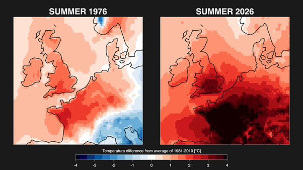
Two graphics from the Climate Lab article showing an outline map focused on the UK and France. They are coloured to represent the temperature difference from average in the summers of 1976 and 2026. There is a lot more blue on the 1976 map (cooler) and a lot more dark red on the 2026 map (hot).
Graphics from Ed Hawkins’ Climate Lab Book.

(of course the critical thinker in me also notes that using a different colour scheme would make this graphic look very different …)

Returning to our train travellers, had they dug a little deeper they would now be able to test their hypothesis against the evidence:

‘I suppose it wasn’t as hot down here this summer’ – actually the evidence shows it was very hot throughout all of the south and midlands, not just in the south east. And since the threshold for a heatwave in the southwest is 25 degrees, it too experienced heatwave conditions throughout all the summer months.

‘I expect it will be just like 1976. After that was all over things just returned to normal again very quickly’ – actually the evidence shows that ‘while extremes have happened in the past, our warmer climate is making them even more extreme’. ‘The summer of 1976 remains one of the UK’s most iconic heatwaves, but it also provides a benchmark for understanding how extreme heat may evolve in a warming climate.’
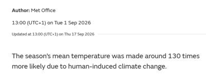
Screenshot from the Met article. Text reads 'The season's mean temperature was made around 130 times more likely due to human-induced climate change'.

Critical thinking has revealed that anecdotal evidence (this is just like what I experienced in 1976) is weak because it may not be representative, and it won’t reveal the full picture. It can also show the illogical reasoning at the heart things. This is just an extraordinary year like in 1976 / in future I need to plant in anticipation of drought conditions becoming the norm – these are contradictory positions. The thinker’s ideas and interpretation is at odds with their behaviour, logic show that their ideas are out of step with the reality experienced around them.

This case study is an example of why the rigorous, original, critical thinking fostered by the humanities must go hand in hand with the methods of scientists and engineers. For there are many many reasons for rich and powerful people to misrepresent evidence of all kinds. The world as it is now has made them rich and powerful, so naturally they want to keep it that way. Scientific data might shows us the dangers of failing to change our world, but that data is useless unless people see it, are convinced by it, and want to act in light of it. Arts, humanities and social sciences can ensure that people have the critical ability to see it, perceive it, and be persuaded by it.

Tl;dr: Save Arts and Humanities

Becoming Home: Football and Geographic Identity in Early Modern Britain

This summer’s football World Cup has prompted lots of talk of ‘historic’ matches and rivalries that have played out over decades, but the game’s history – and its connection with geographic identities – goes back much further than you might think. In this guest post, Taylor Aucoin, University of Edinburgh, takes us back several centuries to some early modern footballing rivalries. You can follow Taylor’s project on medieval and early modern football here.

Every Sunday in the early months of 1765, Welsh and Irish sides numbering in the hundreds played football in the White-Conduit Fields of Islington (better known for early games of cricket). One such ‘grand camping match’ caught the attention of the London newspapers. When a Welshman called one Irishman a slur, the game dissolved into a bloody brawl. Both sides armed themselves with ‘sticks and other weapons…forced from the spectators’, and waged a desperate pitched battle. Eventually, ‘the ancient Britons were obliged to retire, and leave the Hibernian heroes masters of the field’.[1]

The reports portray premodern football as a violent and chaotic game, but there are familiar elements too: a popular spectator sport played regularly in defined spaces by ethno-national teams. While these games between immigrants were a far cry from the first international matches between England and Scotland in the 1870s (both rugby and association rules), they underscore the sport’s longstanding and special relationship with geographic identity. Well before World Cups, FIFA, national teams, or modern associations and clubs, football epitomized place and home throughout early modern Britain.

Fierce football rivalries are nothing new

All sports can be engines and emblems of identity; through organised play, people forge a sense of self and community, and put it on display. Football is not unique to this process, yet its modern codes (especially association) have become privileged vehicles of local, regional and national identity in their respective sporting cultures. But this is nothing new. Modern football forms trace their shared heritage to medieval and early modern folk games, especially those of the ‘Home Nations’. And more so than other sports of that time, premodern football manifested locality through its representative teams, its interaction with place and countryside, and its defence of customary land rights.

Continue reading

Historians, PhDs and Jobs in 2026

Brodie Waddell

When I last wrote about the employment situation for historians back in 2023, the situation was not looking very bright. It has, however, somehow gotten much worse since then.

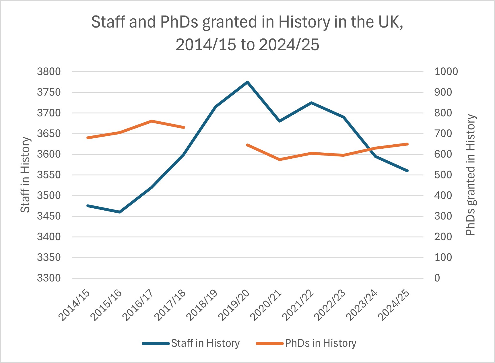
This short post is an attempt to share some basic data about the number of PhDs granted per year and the number of historians employed in UK universities, based on the figured published by the Higher Education Statistics Agency (HESA), which recently released its latest data up to 2024/25.

Before going further, I should note that the University and College Union branch at Queen Mary University of London has been doing the grim but invaluable work of collating reports of job losses across the sector on their UK HE Shrinking page, which includes much more recent evidence than the HESA data. I would also point readers to the Royal Historical Society’s page on Data on the UK Historical Discipline and Profession, which brings together valuable material.

There is now less solid information about the situation in the USA, though everyone will be aware of the terrible circumstances many historians are facing there. In my previous post, I noted that the American Historical Association had stopped publishing their Chart of Doom every year and now it seems they have even stopped issuing an annual Academic Jobs Report, which was last released in 2023.

The HESA data for the UK can be put into a simple spreadsheet and visualised as a chart of total staff employed in History in Higher Education, compared to the number of PhDs in History granted each year.

In 2024/25, there were 3,560 staff employed and 650 students awarded PhDs in History in UK universities.

(Note that the staff figures are for total number of people employed in this area on December 1st. The HESA data on full-time equivalents is more complicated, but for ‘academic (excluding atypical)’ FTE staff in History, the figure is 2,875 in 2024/25.)

All data from HESA. Note that the left axis and right axis are on different scales, so they are comparable in relative but not absolute terms.

In the UK, the HESA data shows a few obvious trends. First, the number of staff in History rose fairly steadily from 2014/15 before peaking in 2019/20 and then mostly falling to the current low in 2024/25, the lowest number for about a decade. Second, the number of PhDs granted in History has bounced around each year since the mid-2010s rather than following a clear trajectory. Finally, the upshot of those two patterns is that the number of current staff per new PhD has reached the worst ratio since at least 2019/20. One PhD was awarded for every 5.5 current History staff in 2024/25.

As with my previous update, I’ll end by simply saying join the union and look out for each other, because the government and our employers aren’t going to.


I have put the raw data into an Excel spreadsheet:

Please link to this blog post to provide context if sharing the chart or data.


Postscript, 21/05/2026: The American Historical Association just published ‘The 2025 Academic Jobs Report’. It notes that: ‘recent estimates of the number of history faculty at two- and four-year institutions by the US Bureau of Labor Statistics (BLS) shows a decline of 16 percent from 2015 to 2024, and an analysis of full-time faculty listed in the AHA’s Directory of History Departments shows a decline of 13 percent from 2010 to 2025’. So the number of staff in history departments in the USA seems to have peaked in 2015 according to one measure or 2010 according to another measure. Meanwhile, ‘the number of tenure-line jobs advertised with the AHA Career Center last year fell to the smallest number since the pandemic’. So hiring has also been falling for the last five years and, excluding the pandemic, is at the lowest level in a decade.

Is Walking Research? A Methodological Ramble

Mark Hailwood

I needed to try something to get me writing again. Blessed with a period of research leave to resume work on my book – Everyday Life in the Seventeenth Century English Village – I found staring at a blank Word document wasn’t doing the trick. So, I decided to go for a walk.

I don’t need much of an excuse to go walking. I often do so to get my thoughts in order and my creativity sparked. But going for a turn around the block just wasn’t cutting it this time. Thankfully the answer was right in front of me: I had been transcribing a case from the 1620s that I planned to use for the book, which detailed the ‘beating of the bounds’ of the Somerset parish of Portishead, my hometown. I’d had the idea of writing up an imaginative recreation of this walk around the parish boundaries to introduce the landscape of a typical seventeenth century English village to my readers. What better way to get this chapter moving than to set about actually retracing the walk myself? This would not be any old walk; it would be a ‘research walk’. And a good excuse to have a pub lunch on a workday.

One walk turned into four, and throughout the dreary days of December and January, I used them to kick start periods of intense writing. I took photos on the way around, and compiled threads on Bluesky as a way of creating notes on what I had seen and thought. You can find them, and relive the walks yourself, via the links below:

Walk One: The Moors

Walk Two: The Church and the Mill

Walk Three: Up the Down

Walk Four: Around the Headland

If you are primarily interested in the history of Portishead, or just fancy a circuit of a seventeenth century village, then I would suggest heading to these threads now – the rest of this post is about to take a methodological turn that is only likely to be of interest to historians and other academics. If that is your bag though, read on. 

Continue reading

The Experience of Work in Early Modern England IV: Harvesters

This post is part of a series that marks the publication of The Experience of Work in Early Modern England. The book is co-authored by monster head Mark Hailwood, along with Jane Whittle, Hannah Robb, and Taylor Aucoin. It uses court depositions to explore everyday working life between 1500 and 1700, with a particular focus on how gender shaped work. It is an open access publication (i.e. it is available to view/download for free, here). The post first appeared on the ‘Women’s Work in Rural England, 1500-1700′ blog as a ‘work in progress’ piece in 2019 – it is reposted here to whet your appetite for finding out where the research ended up, which you can do by reading the book!

Mark Hailwood

As Clare Leighton put it so elegantly in her 1933 The Farmer’s Year, it is that time of year when ‘summer begins to tire’. For centuries of farmers it has been the time when ‘the supreme moment of his year is upon him’, and across the ‘vast sweep of landscape there is the golden glow of harvest.’ It is August, and ‘harvesting is due’.

Of course, it is not only the supreme moment of the year for the individual farmer: for our preindustrial forebears the harvest was, as Steve Hindle has put it, ‘the heartbeat of the whole economy’.[1] The economic fortunes of early modern societies were bound up with the quality and quantity of grain gathered from the fields at summer’s end.

The importance of the early modern harvest, a process so evocatively captured by Pieter Bruegel the Elder in 1565, can hardly be overstated, and when the time came to set it in motion it dominated men’s work schedules above all else: ‘the harvesting draws all men to it. Ploughboy and cowman, carter and shepherd, all are in the fields’ (Leighton again). But what of the role played by women in the ‘supreme moment’ of the agricultural cycle? It is another question our project can shed some light upon.

Continue reading

The Experience of Work in Early Modern England III: ‘Ploughmen go whistling to their toils’

This post is part of a series that marks the publication of The Experience of Work in Early Modern England. The book is co-authored by monster head Mark Hailwood, along with Jane Whittle, Hannah Robb, and Taylor Aucoin. It uses court depositions to explore everyday working life between 1500 and 1700, with a particular focus on how gender shaped work. It is an open access publication (i.e. it is available to view/download for free, here). The post first appeared on the ‘Women’s Work in Rural England, 1500-1700′ blog as a ‘work in progress’ piece in 2017 – it is reposted here to whet your appetite for finding out where the research ended up, which you can do by reading the book!

Mark Hailwood

leighton_november_1024x1024
Engraving from Clare Leighton’s wonderful book The Farmer’s Year

As a treat for surviving a long winter of data entry, I have indulged myself in recent days with some invigorating morning walks, enjoying the first signs of the turnover of the seasons (well, we have one daffodil out in the garden at least) a phase that the poet John Clare called ‘the thaw’ (the title of this post is borrowed from Clare too).[1] This time of year was a key watershed in the early modern agricultural year, of course, as thoughts drifted back to the fields after their dormant winter. With the passing of the frosts it was time to start ploughing the earth in preparation for sowing crops in the spring. It was time to set the agricultural cycle in motion once more.

It seems a reasonable assumption that it was not a favourite work task in the period, yoking the oxen (in the vast majority of our examples it was oxen rather than horses pulling the plough[2]) and heading out in inclement weather (Clare again: ‘March month of “many weathers” wildly comes’). There was certainly an element of danger involved. On 21st February 1564, James Treherne, a servant, was ‘driving six oxen of his master’s drawing a plough tilling the ground’ in Rowde, Wiltshire, when one of the oxen knocked him down, whereby he fell on an axe he was carrying and was fatally wounded. In 1651, Thomas Harding, of Bradninch, Devon, was giving testimony in a testamentary dispute when he recalled that the deceased, Thomas Potter of Broadhembury, had ‘died of a wound received by a ploughshare [blade] in his thigh as he was in a field at plough, which happened some days before his death’.

Continue reading

The Experience of Work in Early Modern England II: Family Fortunes

This post is part of a series that marks the publication of The Experience of Work in Early Modern England. The book is co-authored by monster head Mark Hailwood, along with Jane Whittle, Hannah Robb, and Taylor Aucoin. It uses court depositions to explore everyday working life between 1500 and 1700, with a particular focus on how gender shaped work. It is an open access publication (i.e. it is available to view/download for free, here). The post first appeared on the ‘Women’s Work in Rural England, 1500-1700′ blog as a ‘work in progress’ piece in 2016 – it is reposted here to whet your appetite for finding out where the research ended up, which you can do by reading the book!

Mark Hailwood

I often describe the main bulk of the work that underpins this project as ‘data entry’. But perhaps ‘data entry’ isn’t the best way to describe the harvesting process that has been our focus: reading thousands of depositions (I recently estimated that I’ve read somewhere between 6000-7000 individual depositions so far this year) and all of the stories of everyday life that they contain, and then carefully converting these complex qualitative sources into usable quantitative data, is a more varied and stimulating exercise than the term ‘data entry’ conjures up.

One of the upshots of this kind of work is that in among all the lengthy tithe and testamentary disputes that often turn out to be of little use to us, you occasional unearth a remarkably rich case that contains a veritable jackpot of work activities. And it is one such case that I want to discuss in this post.

‘Households in a landscape’

Step forward: the Conant Family of Moretonhampstead.

Continue reading

The Experience of Work in Early Modern England I: Winter is Coming

This post is part of a series that marks the publication of The Experience of Work in Early Modern England. The book is co-authored by monster head Mark Hailwood, along with Jane Whittle, Hannah Robb, and Taylor Aucoin. It uses court depositions to explore everyday working life between 1500 and 1700, with a particular focus on how gender shaped work. It is an open access publication (i.e. it is available to view/download for free, here). The post first appeared on the ‘Women’s Work in Rural England, 1500-1700′ blog as a ‘work in progress’ piece in 2015 – it is reposted here to whet your appetite for finding out where the research ended up, which you can do by reading the book!

Mark Hailwood

Brueghelian winter
Brueghelian winter

One aspect of the experience of work that our data sheds light on is seasonal patterns in work activities. As the English nights start to draw in, we ask: what tasks did early modern English workers do to make ready for the onset of winter?

A significant number of our examples from late November and early December relate to the replenishing of wood supplies to fuel much-needed winter fires. On the 25th of November 1591, Thomas Ven, an 80-year-old husbandman of King’s Brompton in Somerset, was up a ladder pruning an oak tree with an axe when he plummeted to his death. Locals must have started to wonder if evil spirits possessed the wood of Barlynch Grove, where Ven had fallen, for in December of the following year the 28-year-old Edward Norman met his end by falling out of an ash tree that he had climbed to cut branches from.

Continue reading

Teaching early modern History with Images

This is the fourth guest post in the mini-series Visual Culture in Early Modern England (read the introduction and find links to other posts here). Adam Morton shares his experience of using images to get students talking in seminars, exploring their ability to get students thinking about things like opinion, polemic and ambivalence in primary material.

Adam Morton is Reader in Early Modern British History at Newcastle University. He researches the long-Reformation in England, with a particular focus on anti-popery and visual culture. His publications include Civil Religion in the early modern Anglophone World (Boydell & Brewer, 2024) (with Rachel Hammersley), The Power of Laughter & Satire in Early Modern Britain: Political and Religious Culture, 1500-1820 (Boydell & Brewer, 2017) (with Mark Knights), Queens Consort, Cultural Transfer and European Politics, c.1500-1800 (Routledge, 2016) (with Helen Watanabe-O’Kelly), and Getting Along? Religious Identities and Confessional Relations in Early Modern England – Essays in Honour of Professor W.J. Sheils (Routledge, 2012). His current project considers the visual culture of intolerance in early modern England.

Adam Morton

I’ve always found that images get History students talking. They see things I don’t see and ask questions I’ve not thought to ask. The chattiest students are often the ones I least expect, the ones who have been quiet in previous weeks, the ones you worry are struggling with or not enjoying the course. Approaching a seminar topic through images can bring those students out of themselves.

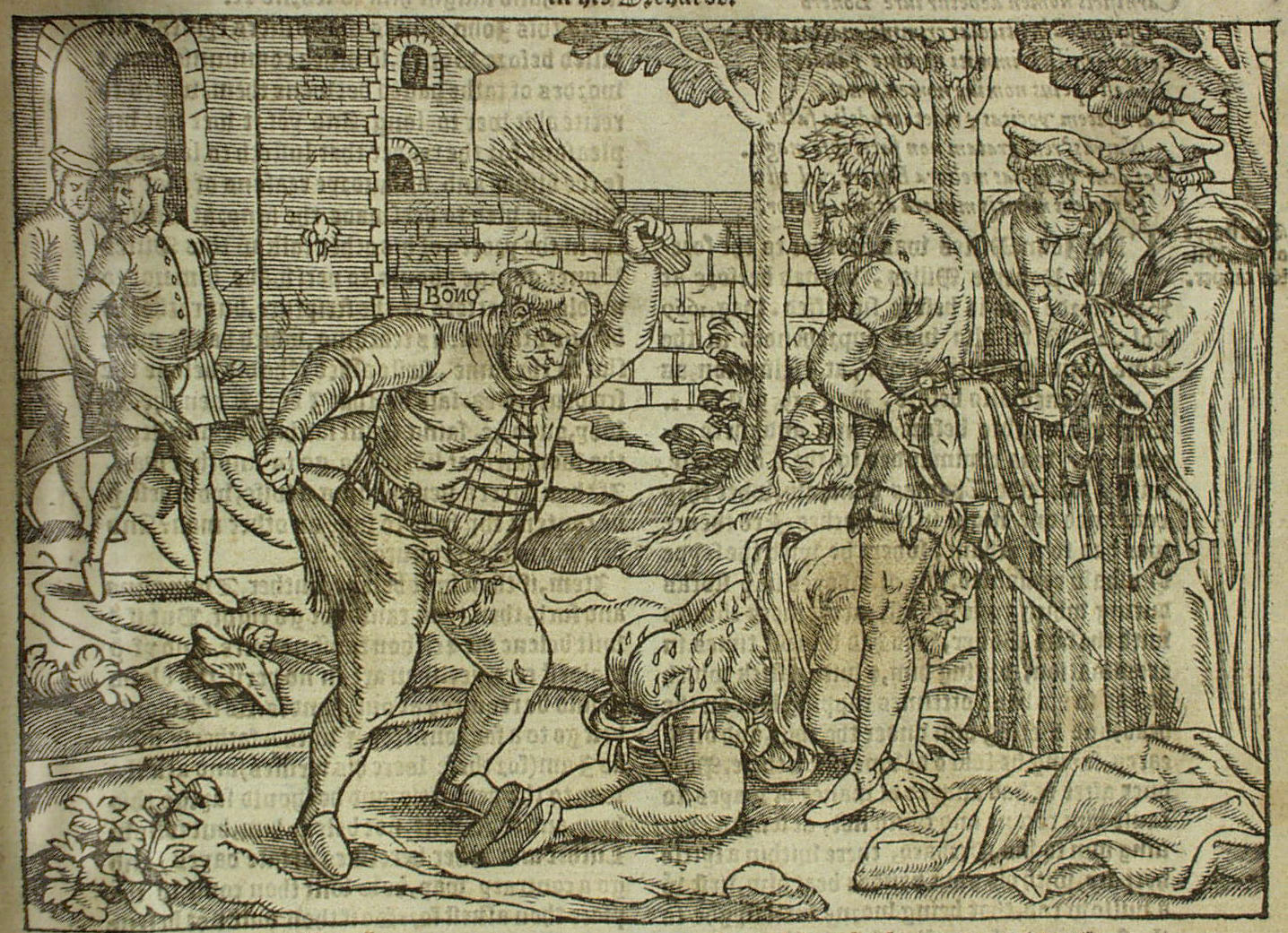
I remember one instance, long ago on a second year Reformation course timetabled in the drabness and drizzle of the autumn term’s Friday afternoon slot, with fondness. A woodcut from John Foxe’s Acts and Monuments showing Edmund Bonner, the Bishop of London, stripped to his underwear and thrashing a Protestant’s buttocks, left one usually quiet student tripping over her tongue with things to say [Fig. 1].[1] She prodded the seminar to life with thoughts about humour, about cruelty and humiliation, about images as acts of revenge, and about the control involved in having the power to portray someone. Long dead Reformers suddenly seemed very human to her. “Is the image sexual?”, she asked the room. The discussion took off. Now I was the silent one: the teaching was going well.

Figure 1. TITLE from John Foxe, Acts and Monuments (1570).

Foxe’s woodcuts are an obvious candidate for primary sources in undergraduate seminars, of course. Although they are no longer as rooted in public life as firmly as they were two generations ago, ‘The Book of Martyrs’’ images still provide a way into the big problems of Reformation history in the seminar room because they offer us dramatic vignettes that pare abstractions – martyrdom, heresy, theology, and memory – down to something tangible. But images can be much more than ice breakers. They can be the bedrock of seminar discussion, too. Continue reading

Cut, copy, paste: what people did with early modern Printed Images

This is the third guest post in the mini-series Visual Culture in Early Modern England (read the introduction and find links to other posts here). As in our previous post by Helen Pierce, Malcolm Jones considers how people consumed prints – in this case by adapting them in various ways. Please click on images for enlargements.

Malcolm Jones

In my youth I worked in museums and as a lexicographer, and subsequently until my retirement in 2010, as a lecturer in the English Department of Sheffield University, the year in which my book, The Print in Early Modern England – An Historical Oversight, was published. Since then I have published various articles on early modern prints, and am currently working on a book showcasing the wealth of imagery to be found in early modern alba amicorum (‘friendship books’). These days I do most of my art history informally in maintaining my 100+ Pinterest boards, and exercise my lifelong interest in language in reading the inscriptions on late medieval metal-detectorists’ finds for the British Museum’s Portable Antiquities Scheme.

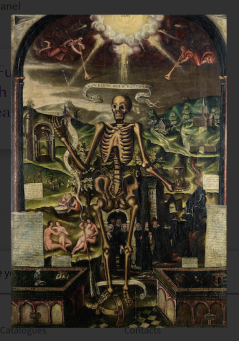
Although unknown to me at the time, just as my book The Print in Early Modern England: an Historical Oversight (London/New Haven, 2010) was going through the press in late 2009, the auctioneers, Bonhams, were selling The Chelsea Collection of Severin Wunderman. I later discovered that Lot 202 was minimally catalogued as a painting on panel, 112 x 77.5 cms., editorially entitled “An Allegory of Death”, described as “English School, circa 1600”, and as “inscribed with various verses from the Bible”. [Figure .1][1]

Figure 1: An Allegory of Death, c.1600.

It was immediately apparent to me that the painting reproduced the entire print known as Death his Anatomy, with the memory of the Righteous, and oblivion of the wicked, in sentences of Scripture,[2] when issued by John Overton in 1669, but that is now only known in the form of four fragments preserved in the British Library, bearing both Peter Stent’s and John Overton’s imprints [Figure. 2].[3] Continue reading