
Brodie Waddell
In the late sixteenth century, the famed Elizabethan poor laws commanded every parish in the kingdom to relieve their poor residents though local taxation rather than private charity. By around 1800, England’s parishes were spending more than £4 million per year on poor relief.
One of my current research projects is an attempt to examine the nature of this massive expansion in formal, institutional support for the most vulnerable members of the community – that is to say, the rise of the so-called ‘parish welfare state’. I’ve been doing this by looking at the amounts spent by local officers – the overseers of the poor – in a set of sample parishes from across the country. Jonathan Healey at Oxford has been doing much the same, and we have recently decided to work together, combine our data and attempt to come up with a new analysis of this oft-noted development.
I will be discussing some of the early findings from this project at a talk on Friday, February 28th, at the Institute for Historical Research in London, so please do come along if you are interested. However, I thought I might offer one image from the talk here as I think it raises some potentially interesting questions.
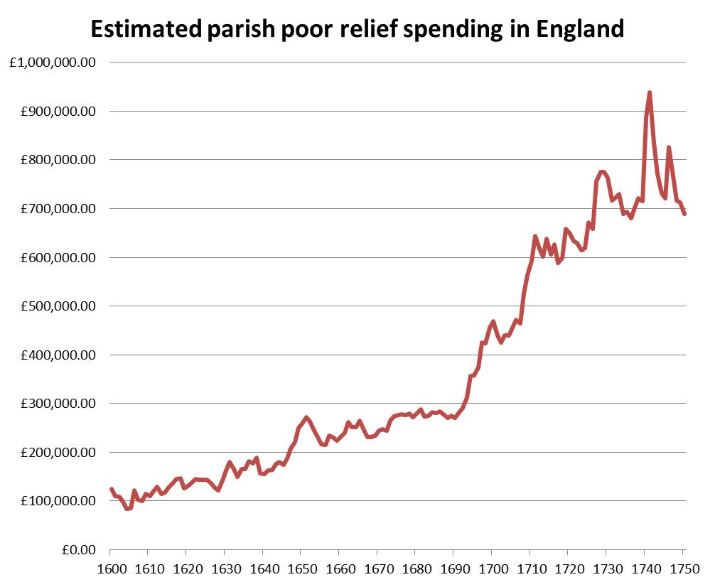 What you see above is an estimate for national annual spending on poor relief based on my sample of 81 parishes. There are some significant methodological problems with these estimates – especially for the first few decades – that I will discuss in my talk. But, for the sake of argument, if we assume that this is actually an accurate measure of relief spending in England, the question then becomes: What does this tell us?
It seems to tell us that there was not simply steady growth in relief in the 17th and 18th centuries. Instead, we see periods of extraordinary expansion, of stability and of retrenchment. We also seem to see a shift in the trajectory of the rise sometime in the decades around 1700, when growth seems to have accelerated markedly.
Yet, this graph is also extremely opaque. There is much that it does not tell us.
For example, what about non-parochial poor relief, such as formal charitable bequests or informal personal giving? Did this follow a similar pattern? Or was it working in the opposite direction?
What, too, about regional differences? Was there similar growth in sleepy country villages as in booming industrial towns?
Even more significantly, this graph tells us little about why parish welfare was expanding in this period. Although we can speculate based what we know about the periods of greatest expansion, the raw numbers in themselves cannot reveal short-term economic pressures or changing legal contexts.
Finally, and perhaps most importantly, this bare line may obscure the nature of relief, which was after all a relationship between human beings who normally knew each other – not simply an anonymous financial transaction.
Did those who received relief actively demand it or passively accept it? Did those who distributed it do so gladly, grudgingly or fearfully – as an act of Christian charity, or out of mere legal obligation, or to stave of the threat of disorder? Was such relief considered the poor’s rightful entitlement? Or was it conditional upon their obedience and reputation for morality?
In other words, whilst this chart may offer a useful bird’s eye view of the emergence of perhaps the world’s first nation-wide welfare system, its lack of a human dimension may also actively mislead us about the nature of this system. For that, we must look to records in which real individuals – such as Mary Stevens, the 101-year-old vagrant – step out of the page to meet us.
Acknowledgements
The 81 sample parishes upon which the chart is based include 24 whose totals were generously provided by other historians. I am therefore very grateful to the late Joan Kent via Steve King (for 9 parishes), Henry French (7 parishes), Jeremy Boulton (3 parishes), Tim Hitchcock & Bob Shoemaker (2 parishes), John Broad (2 parishes) and Steve Hindle (1 parish). If you or any of your colleagues have data on parish poor relief before 1834 that you are willing to share, please get in touch!

This is really fascinating Brodie, and I look forward to hearing more about your research in this area! Sorry to ask such a dull/geeky question, but are those figures adjusted for inflation, and if not, how significantly would that change the graph?
Not a dull question at all. I expect to hear it at the seminar tonight!
The short answer is: in the long-term, adjusting for inflation has a minimal impact, but in the short-term, it has a major impact.
Here’s a very rough and ready visualisation based comparing the unadjusted relief figure (blue) with one deflated by national wheat prices.
http://wp.me/a2yX5J-sT
Interestingly, if you do the same for population, there is almost no change at all:
Pingback: No place like home: Seventeenth-Century Portishead | the many-headed monster